At the risk of repeating ourselves, we would like to emphasize one more time that the quality of a virtual tour depends on much more than just the quality of the media it includes. In order to make a good experience, you need a good design and architecture of the interface that frames the media.
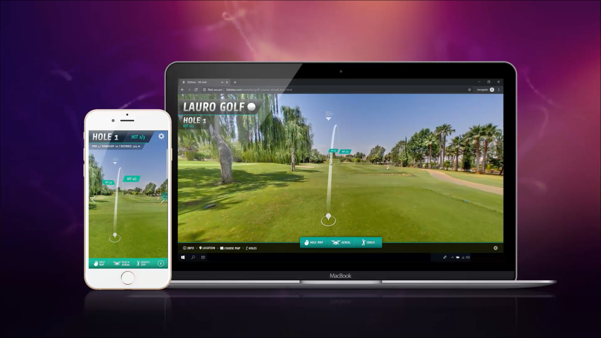
If we compare watching a virtual tour on a computer with watching it on a mobile device, they couldn’t be any more different. They differ in orientation (landscape vs portrait), in size obviously, in dynamic or way of controlling the device and maybe even in terms of the situation in which we use one or the other – where one tends to be used with full attention in a quiet office and the other on the go with more things distracting us. They are two different experiences and they deserve two different. completely optimized designs.
Responsive skins were a good enough solution for most skins and they continue to be for skins that are not too complex. Elements in your skin can automatically adapt to the screen size if you define them in %, the use of containers allows you to maintain button panels and window layouts etc. But it's one thing to make things adapt, and it's another to truly leverage the difference in layout, size and even way and situations of when you use a mobile phone. That's what you can do with the new Dual Skin feature.
Dual Skins and how to create them
Dual skins means that one and the same virtual tour will have two skins — one for desktop and one for mobile or tablet devices which you can optimize with just a couple of touches. The tour itself will detect which device a user is watching the tour on and respectively show one or the other perfectly optimized skin for that.
The tutorial shows how exactly you can create a dual skin without having to actually create two separate skins from scratch. When re-designing your mobile skin interface, we recommend you think about the following:
- Are there elements which I don't necessarily need in my mobile skin at all?
- Are there elements, which I can combine under one menu button?
- Are there elements, which I should move so it's easier to reach them with the hand that holds the mobile device (upper left corners should be reserved for stickers, counters, indicators — buttons should be closer to the bottom and right).
- How can I convert my horizontal windows into vertical windows?
- Are buttons big enough so they can be selected with a finger?
- Is my skin too cluttered? Never distract from the actual content!


0 Комментариев